|
|
Perseus
Dec 18, 2005 21:59:22 GMT -5
Post by Link on Dec 18, 2005 21:59:22 GMT -5
To add comments, make a reply.
|
|
|
|
Perseus
Dec 19, 2005 1:48:49 GMT -5
Post by Mephistopheles on Dec 19, 2005 1:48:49 GMT -5
You know...... this one is pretty bad...... I've seen many drawings by Perseus, why did he put this one?
I'll give him a 3 since it's still better than my drawings.
|
|
|
|
Perseus
Dec 19, 2005 2:16:32 GMT -5
Post by Gamemaniac on Dec 19, 2005 2:16:32 GMT -5
not to bad nor to good ..... I have indeed seen better works from perseus.
|
|
LoRd★YaKoV
Gallery Keeper Official Artist
[x=lordyakov][M:194]
Official Artist
[x=lordyakov][M:194]
Posts: 96
|
Perseus
Jan 23, 2006 19:20:47 GMT -5
Post by LoRd★YaKoV on Jan 23, 2006 19:20:47 GMT -5
im agree with Mephistopheles but you still dont know how to draw women
|
|
Iron Man
Apprentice
 You'll burn in flames of revenge[M:-90]
Posts: 13
|
Perseus
Jan 24, 2006 10:02:49 GMT -5
Post by Iron Man on Jan 24, 2006 10:02:49 GMT -5
I don't like that drawing, it didn't impress me.
|
|
LoRd★YaKoV
Gallery Keeper
Official Artist
[x=lordyakov][M:194]
Posts: 96
|
Perseus
Jan 24, 2006 19:37:58 GMT -5
Post by LoRd★YaKoV on Jan 24, 2006 19:37:58 GMT -5
hahhaa i was just joking i liked alot i think mmmmmmmmmm yeahh i like ti forget about the thing i said i was agree with Mephistopheles.
|
|
|
|
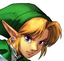
Post by Fuu Henjin on Feb 1, 2006 0:36:58 GMT -5
Hello!... well I already judge the drawings of Lord Yakov... so I have ti be fair and now I will do it with yours...
Here we go...
Bad Things:
1) The whole structure of the body are wrong... the legs longitude are fine but they does not fix because they are very broad... is that or the armor is very pronunciated...
2) He does not have neck... T_T
3) The armor is to big for the boy... I personally recommend you a light one...
4) The head... well what I can say... is... is... well... is not very well done... the eyes are very sad?...or how I can describe it... well you understand me.
5) the hair is horrible... that guy need a brush urgently!
6) The right arm is bigger than the left arm... also are below than the other one... other thing is that I can not notice the elbows and the hand are bigger than the arm!
7) The main problem here is the armor... please try it with another one...
Good things:
1) The sword and the sickle are excellent, the details are very important and you made it very well
2) You can use shadows! excellent!... but try to figure it in the right place... and also blur it a little more... OK
3) The idea is great just develop it a little more...
Well... I know this is not your best drawing... I also saw other ones 100 times better than this... and also why you upload this?!!... -.-u... Well what I can do....
Please I know you draw to much better than this... see you! ^^
|
|